CHANGE CALLS FOR MORE CHANGES TO OUR BRAND
Once we achieve a specific milestone in our refurbishment project, we will turn our attention to revitalising and enhancing our Brand. The question arises: where should it be prominently displayed, and what approach should we take?
Throughout our thirteen years in business, our Brand has undergone gradual transformations, much like the subtle shifts that occur in any successful Brand. These changes are often so seamless that they can escape notice until examined closely.
As some of you may already be aware, our Brand was conceived by my brother, James, who operates his own Graphic Design and Website Design company called Sear Genius. He has skillfully guided all the adjustments, nuances, and evolutions in our Brand’s appearance during this period.
As The Spa prepares to embark on a new phase of Brand development, we are eagerly embracing and promoting extensions of our business. For instance, Sheldon will be organising regular events on our grounds at specific times throughout the year, in addition to offering customisable event bookings. Alongside these enhancements, we will be introducing a fully stocked and licensed bar. Consequently, we have entrusted James with the task of creating sub-brands for Sheldon Events and Sheldon Bar. Furthermore, we have ambitious plans to launch Sheldon Properties – although that venture is still a bit down the road.
In light of these changes and the excitement surrounding the upcoming developments for our Brand, I invited James to reflect/comment on the creativity behind our logo thus far.


Sheldon Spas’ logo embodies exquisite minimalism; a product of careful evolution rather than an overnight creation. Initially, the logo showcased a rich plum purple, accentuated by percentage shades that added secondary and tertiary touches to form the Brand pallet.
Fast forward over a decade, and the purple has seamlessly transitioned into a captivating bronzed metallic gradient, perfectly complemented by a wood grain effect background in shades of taupe and lighter tones, ensuring the logo truly stands out.
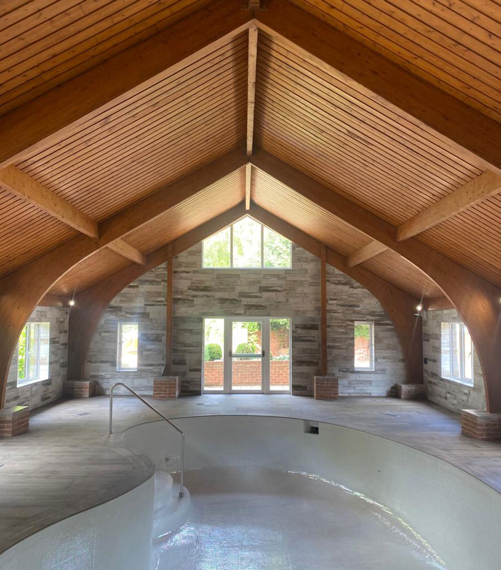
Throughout the shifts in colors, one crucial element has remained constant; the distinctive arch crowning the word ‘SPA’. This elegant design element pays homage to the oak gable ends of the pool building, infusing the logo with its quintessential charm and character.
The choice of font brings further enchantment and finesse. Arno Pro, a serif typeface with ornamental strokes at the end of each letter, adds a touch of tradition to the logo. Yet, the juxtaposition with the arch delivers a modern dimension, creating a truly captivating look and feel.
BRAND ADAPTABILITY
In response to the demands of the social media era, the ‘SS’ icon was ingeniously born; a mirrored ‘S’ forming a heart shape that serves as a powerful avatar. This condensed version of the Brand has won the hearts of a more inclusive and younger demographic, exemplifying the logo’s versatility and timeless appeal in any setting. Sear Genius look forward to the challenge of encapsulating the new areas of Sheldon’s business portfolio within the already established parent Brand.
The team can’t wait to see James’ proposals!